Fitted Case Study
Timeline
6 Weeks August - October
Role
UI Designer
The Problem
Discovering exercise routines that align with your abilities can be a real challenge, regardless of whether you're a beginner or an already experienced fitness enthusiast.
Many individuals face difficulties in locating exercises that suit their skill level, offer enjoyment, and can be integrated into a consistent and sustainable fitness routine.
The Solution
Fitted.
Fitted is a new product that aims to help people meet their fitness goals by providing routines, learning guides, interactive examples, and further info on various types of fitness.
User Flows
As a UX Designer, focusing on UI design for this project, I was aware of the necessity to design with a strong user-centric approach.
I initiated the process by reviewing the user persona Rebecca. Delving into her specific goals for the application, such as "integrating exercise routines into a busy schedule" and "discovering enjoyable workout routines" allowed me to connect with the user goals for this product more deeply. Armed with these objectives, I began development of Information Architecture and User Flows aimed at helping Fitted's users like Rebecca meet their goals and overcome their challenges.
Low Fidelity Designs and Early Prototype
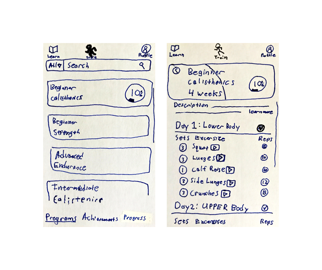
After creating my user flows I then started building some basic prototypes with pen and paper!
This is my favorite way to begin designing, the blank page forces me to really create something of my own. From there I can then turn it into some basic digital prototypes, seeing what works and what didn’t work from the paper version.
Visual Inspiration
With a low-fidelity design in place, the next step involved sourcing visual inspiration to move towards mid-fidelity and, ultimately, high-fidelity designs.
To achieve this, I utilized mood boards, creating multiple versions to guide me in determining the design direction. Ultimately, I opted for a design concept that embodied the ideas of Routine, Challenge, and Health.
Mid Fidelity Design
It was time to take my inspiration from the mood boards and start to build mid-fidelity designs.
First beginning with the proper grid layout, then building out navigation features, and finally creating cards in greyscale. Below you can see the iterations my mid-fidelity design went through.
I learned and implemented the 8 pt grid system. It allowed my layouts to easily fall into place, resulting in an organized and structured appearance.
Font Breakdown
At this point in designing the user interface for Fitted, it was time to select a font. After deep consideration, I opted for the Inter font.
This was a challenging decision, I initially explored another font named Supreme. However, I discovered that Supreme wasn't a web font, which could potentially create difficulties for users who hadn't downloaded the font onto their systems. In light of this, I made the decision to switch to Inter, as it effectively represented the ideas of Challenge and Routine I wanted the font to convey.
Color Choice
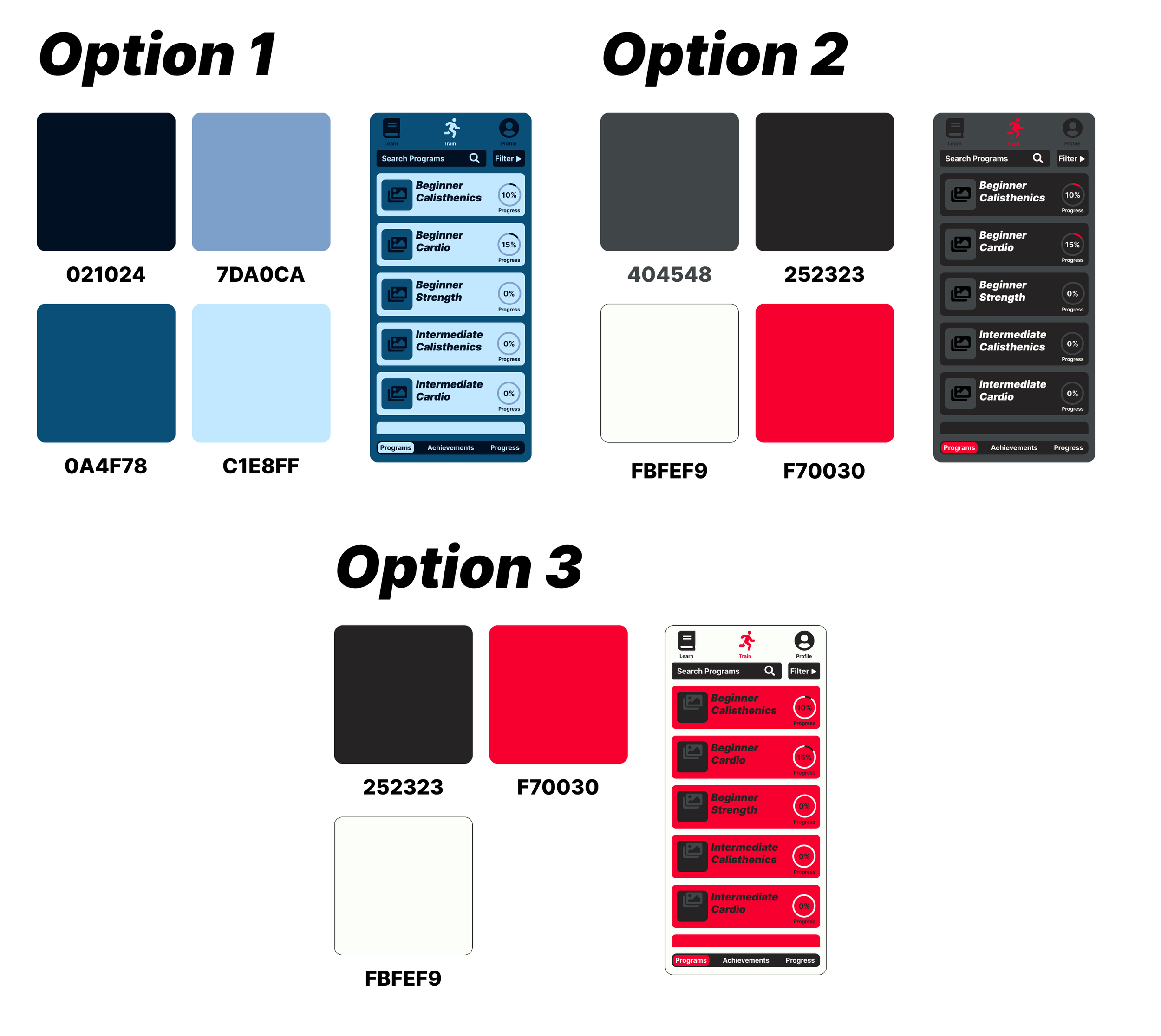
Selecting the color palette is undoubtedly one of the most exciting and crucial aspects of UI design. In this phase, I explored several options before arriving at a final choice.
After careful consideration, I ultimately settled on the third option I explored. I found it to be the most effective in displaying a sense of routine and challenge while bringing a feeling of excitement and energy, thanks to the use of the red-orange color. In comparison, I preferred it over the more relaxing blue version and the slightly more subdued grey/black alternative. Additionally, this version offers the best contrast, ensuring the best usability.
Selecting Icons
After selecting a font I moved on to select and create Icons for Fitted. I created the Fitted Brand Icon. I wanted it to be simple, recognizable, and to convey a sense of energy.
I created this minimalistic icon with a forward slant and sharp edges to display that energy. For the rest of the Icons I went with the Font Awesome Icon Pack. It provided basic and easy to understand icons.
Style Guide
Constructing a look and feel.
Building the style guide was a wonderful opportunity to create harmony in the design. It pushed me to make sure everything was cohesive with the look and feel of the design.
You can view the style guide here.
Hi-Fidelity Designs and Prototype
I very much enjoyed polishing the design and moving it from mid-fidelity to hi-fidelity.
It was at this point also I began to work on bringing the design to life with Figma animations. I spent a lot of time learning to create some cool animations in Figma, I feel they really help a potential user get a good idea of what the product could be like to use in real life! Check out my Figma animations in the prototype below.
Final Mock Ups
Reflection
Fitted was a UI Design focused project, and it proved to be a phenomenal learning experience. As I progressed through this project, I gained valuable insights and really grew in confidence as a designer. I encountered several impactful concepts that I intend to incorporate into all my future designs.
Grids and Spacing. Starting my design with a well-established grid and a strong spacing plan was huge. It made organizing and laying out each page so much more simple. Learning and implementing the 8 pt grid system was one of those light bulb moments for me in design. It suddenly saw my layouts seamlessly falling into place, resulting in a clean and well-defined appearance. I am now a meticulous implementer of grids and spacing.
Web Fonts. Learning about web fonts was a crucial step in my UI design studies. While fonts have always intrigued me, I quickly discovered the challenges in selecting fonts as a UI designer. These challenges include things I expected such as readability, legibility, and establishing a strong hierarchy. Additionally, I encountered specific issues related to web fonts and their limitations. As a result, I had to change my font choice several times before finding a suitable option for web design. It’s a lesson I will take with me the rest of my design career.
Figma Animations. In this project, I took an in depth look into creating Figma animations. I discovered that they are relatively easy to learn and have the ability to breathe life into a design. Animations provide a more vivid representation of the user experience, going beyond the static design in capturing how the product will feel in real use. While static designs establish the product's look and feel, the use of Figma animations allows for a more immersive user experience. This is a skill I plan to continue to sharpen and use to bring my designs to life.
Thank you for viewing my work, I grew in many ways as a designer on this project.


